Spicing up the World Map!
/A student’s short commentary led me last Fall to a world map that includes an “analemma.” I was greatly surprised by this, because some work I did most of a decade ago indicated that this device was actually found only on globes (Edney 2018). What’s this device doing on a two-dimensional world map? Trying to answer this question made me look in detail at the map and its deployment of map history to promote the modern-day spice trade.
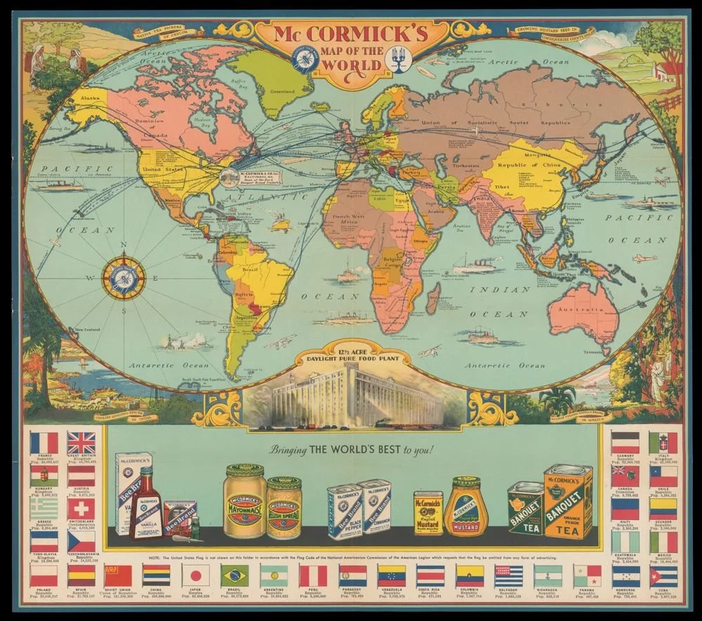
Here is the world map in question,

“McCormick’s Map of the World” [title on verso, cover panel] (Baltimore, 1957). Color lithograph on sheet 59 × 88 cm. Osher Map Library and Smith Center for Cartographic Education, University of Southern Maine. Click on image to access in high resolution image https://oshermaps.org/map/56196.0001
This map was made in or after 1957 by McCormick & Co., of Baltimore, Maryland. McCormick was a major importer, processor, and distributor of spices, teas, and flavorings that they sourced from around the world. Its PR department had first issued promotional world maps in the 1930s, identifying the sources of all the plants it then processed, giving extensive information on the verso about the plants and the spices and flavorings they produced, and showing pictures of some of the packaged goods one might buy in US stores.
McCormick’s 1931 Map of World Spice Trade
OML has a “McCormick’s Map of the World” from 1931:
“McCormick’s Map of the World” (Baltimore, 1931). Color lithograph on sheet 59 × 88 cm. Osher Map Library and Smith Center for Cartographic Education, University of Southern Maine. Click on image to access in high resolution image https://oshermaps.org/map/54222.0001
When folded down as a brochure, its cover depicts an old clipper ship over the main title, “From Singapore to Baltimore,” in exoticized type. Opening the brochure gives a distant sea scape contrasting a slow-moving Chinese junk with the fleet clipper, suggesting the superiority and progress of Western culture.

Covers and interior spread of McCormick’s 1931 map. Osher Map Library and Smith Center for Cartographic Education, University of Southern Maine. Click on image to access in high resolution image https://oshermaps.org/map/54222.0002
Most of the interior spread has a markedly educational flavor. A panel rather misleadingly entitled “The Story of the Map of the World” explains how McCormick’s maps are “up-to-date with colorful facts about the countries of the world” that can be used as the basis for “a new home game called ‘The Tour of the World,’” in which one person asks another questions to be answered by the other players. The questions might be taken from the list of example questions—answers provided on the back of the closed brochure—or taken from the wealth of information about the global spice trade on the rest of the verso (not imaged here).
The 1931 map is absolutely about the contemporary world and expresses modernist concerns about scientific and technological progress. The map bears small icons of large, thoroughly modern steamships plying the oceans, as well as the routes of pioneering aviators (those across the Atlantic seeming to converge on McCormick’s headquarters in Baltimore):

This emphasis on global navigation—which was of course usually associated with world maps on Mercator’s projection—was further indicated in the 1931 map by the placement of a compass rose and a radiating spray of rhumb lines (lines of constant bearing) that reached out across, and filled in an otherwise empty portion of, the southern Pacific Ocean:

Finally, the 1931 map downplayed any sense of nationalism. It does not even show the Stars & Stripes in the array of thirty-two flags of the world’s major nations arrayed across the bottom of the map, noting instead that “The United States flag is not shown on this folder in accordance with the Flag Code of the National Americanism Commission of the American Legion which requests that the flag be omitted from any form of advertising.”
McCormick’s Spiced-up 1957 Map
At first glance, the 1957 map looks quite similar to the 1931 map. It has the same shape and is also covered in routes. Its spandrels contain (different) views of the harvesting of the raw materials for McCormick’s spices and teas. It bears a similar array of national flags and population figures, moving alphabetically in an anticlockwise manner around the margin, so that the Stars and Stripes of the USA occupies a prominent position in the top-right corner. The front and rear images of the brochure, when the map is folded down, still contrast the American clipper with the Chinese junk, but makes the comparison even more obvious. The front cover presented a painting of a clipper from the previous century: the “Ann McKim,” built in Baltimore in 1832 and the acknowledged prototype for the famous “Yankee Clipper Ships” used in the China Trade, surmounted by the flags of the United States, Baltimore, and Maryland:

Covers and interior spread of McCormick’s 1957 map. Osher Map Library and Smith Center for Cartographic Education, University of Southern Maine. Click on image to access in high resolution image https://oshermaps.org/map/56196.0002
The cover repeats McCormick’s catchphrase in the lower corner:
From all the World – Known the World over
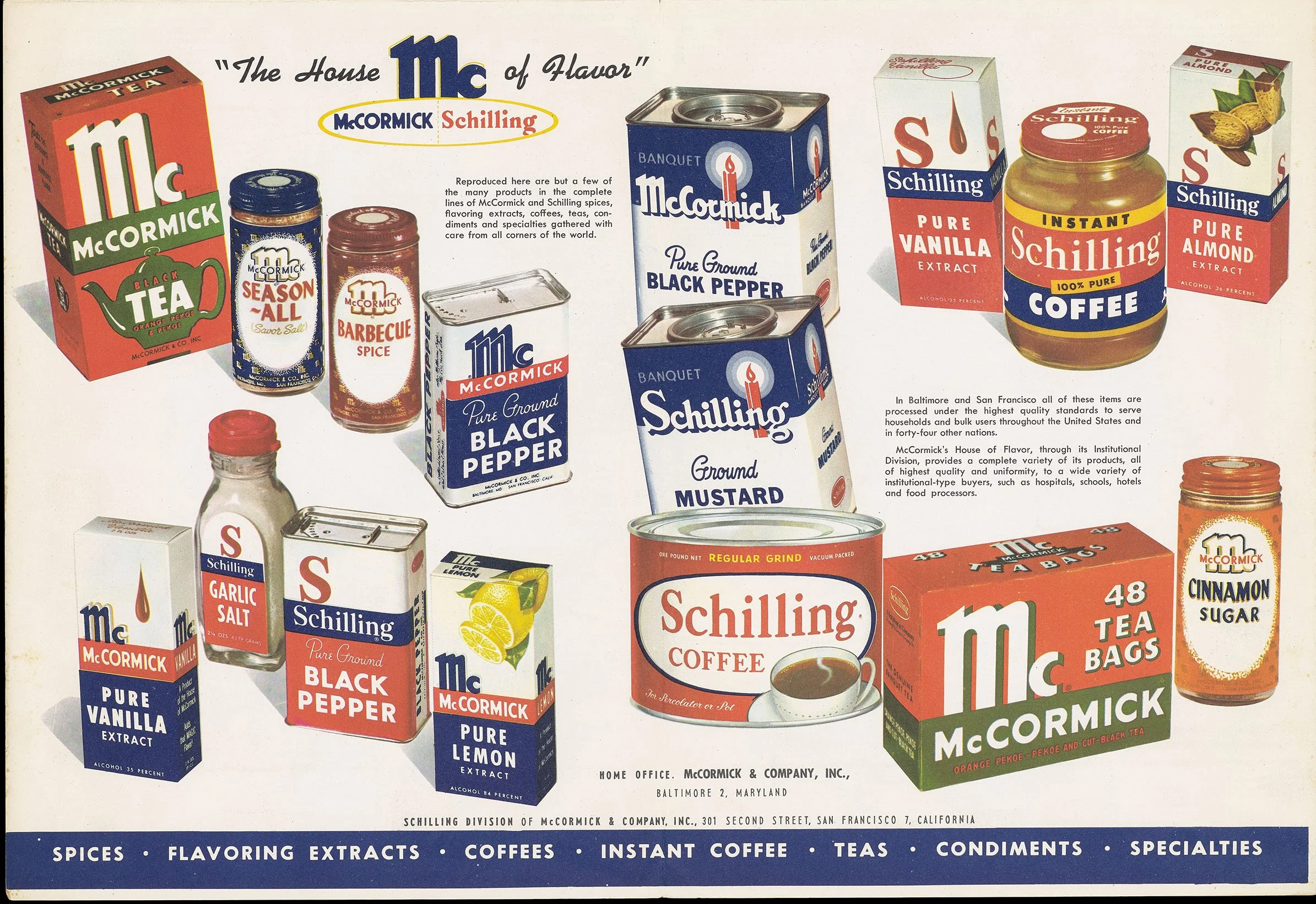
But the work has changed in several significant ways. The educational mission is downplayed. A series of twenty-one questions about various spices and their use (the first 5 dealing with Vanilla) appear on the back cover, all explained in the text that took up half of the map’s verso (not imaged here). The information about spices and flavorings is now grandiosely called the “encyclopedia of flavoring extracts, spices, teas, coffees,” and was greatly updated over the 1931 map to reflect McCormick’s 1947 acquisition of its San Francisco-based competitor, Schilling & Co. The newer map advertised both sets of brands in a much larger display:
The 1957 map has the same, fascinating geographical foundation as the 1931 map: the countries of the world were mapped on a cylindrical Gall Stereographic projection [n1] that was then curvaceously cropped to mimic the once-popular form of the double-hemisphere world map. Why did the designers work this way? Why not just trace a double-hemisphere world map? A pragmatic reason might have been that no double-hemisphere map was readily available that depicted the world’s current countries; double-hemisphere maps had mostly been used, although not entirely so, to show the earth’s physical environment without political borders and they had largely fallen out of fashion since 1918. Furthermore, the designers might have wanted to keep the look of a rectangular world map that would have been familiar and not off-putting to their customers, albeit without the excessive poleward distortions of Mercator’s projection.
On the 1957 map, however, the fake frame has clear significance. Overall, the map expresses a post-war ethos. Airplanes now easily crossed the oceans and continents; there was no longer a cultural need to emphasize ongoing technological progress towards that end. Instead, there was a general turn to emphasizing the history of global trade and mapping, not in a nostalgic manner but to emphasize the origins of what would become modern, factual cartography. The map is full of historical references, beginning with the history of the Ann McKim on the cover, and sustained by reference to a number of nationalistic sources in the bottom margin:
Historical References: Muzzey, A History of Our Country. McQuire [sic], et al, The Rise of Our Free Nation. Barker, et al, Our Nation. Hathaway, Romance of the American Map. Lord & Lord, Historical Atlas of the United States[.] Adams, Atlas of American History. Rugg, A History of American Civilization
That is:
Muzzey, David Saville. 1936. A History of Our Country: A Textbook for High-School Students. Boston, London: Ginn and Co.
McGuire, Edna, and Thomas B. Portwood. 1942. The Rise of Our Free Nation. New York: Macmillan.
Barker, Eugene C., and Henry Steele Commager. 1941. Our Nation. Evanston, IL, and New York: Row, Peterson and Co.
Hathaway, Esse V. 1934. The Romance of the American Map. New York: Whittlesey House, 1934.
Lord, Clifford L., and Elizabeth H. Lord. 1944. Historical atlas of the United States. New York: H. Holt and Co.
Adams, James Truslow. 1943. Atlas of American History. New York: Charles Scribner’s Sons.
Rugg, Harold Ordway. 1930. A History of American Civilization: Economic and Social. Boston: Ginn and Co.
The images of modern, powerful steamships on the 1931 map have all been replaced by a few images of early modern sailing ships, a sea monster, and three wind heads, all emulating renaissance geographical maps. The 1957 map further shows the routes of past explorers and merchants: Magellan (solid black line), Drake (dotted red line), the Manila Galleon (thick solid red line), and on land Marco Polo (solid red line) and Friar Odoric (dotted red line). The upper margin contains portraits of those intrepid explorers:
above the “hemisphere” of the Old World:
[portraits of Friar Ruysbruk, Marco Polo, Ibn Batuta, Friar Odoric]
The Four Celebrated Overland Travellers. These men effaced the Arabian spice myth and fired the hopes of Europe for direct contact with the Spice Islands… [which islands are enlarged in an inset on the map]
above the “hemisphere” of the New World:
[portraits of John Cabot, Ferdinand Magellan, Christopher Columbus, Vasco da Gama]
Four Famous Explorers of the Sea. These men while searching for shorter routes to the Spice Islands discovered New Lands unknown to Europeans.
In 1957, the faked double-hemisphere format explicitly harkened back to the old structure of double-hemisphere maps as showing the eastern and western hemispheres of the Old and New Worlds (Edney 1994). In the prime location of the top-center margin/spandrel, the map further proclaims Baltimore, McCormick’s home, as the “birthplace of the Star Spangled Banner,” as it had flown during the British naval siege of Fort McHenry in September 1814. The post-war map is unsubtle in its jingoism and commercial self-promotion: the United States exists because of the spice trade as incarnated in the present by McCormick. Buying McCormick products is an act of national devotion!
The Analemma on the Spice Map
A further difference with the 1957 was the preservation of the graticule of latitude and longitude—perhaps because the war had made people used to the lines of meridians and parallels—which further meant that the compass rose no longer emits a spray of rhumb lines. And, accompanying the compass rose, the analemma, albeit with very modernist designs for the signs of the zodiac:

The thing about analemmas, and why I was surprised to see this one on the McCormick map, is that it follows the less common form of analemma. Overall, two kinds of analemma were added to some globes made in eighteenth-century London before they proliferated on other British and American globes in the nineteenth and twentieth centuries:

First, the oval device, intended as a means to determine solar declination (the sun’s apparent latitude): the strip of the oval is a calendar; the user rotates the globe so that the device lies beneath the brass meridian circle, and reads off the angle for any given day. Second, the distorted figure-eight or “lemniscate” shape, in which the width indicated the “equation of time” for any day, being the difference between solar time (on sundials) and sidereal or star time (on clocks). Analemmas are not precise, and no one would have used one for an astronomical or chronometric purpose; readily available published tables were much more precise. Rather, analemmas were educational in nature, designed to teach the concepts of solar declination and the equation of time.
The term analemma has also been adopted for the lemniscate shape traced by the movement of the sun in the sky, as in the first image on the Wikipedia page for “analemma.”
The 1957 map, however, used the less common form of an oval. In this respect, the map’s designer plainly knew what they were doing in constructing the analemma. (Or they had copied the work of someone who knew what they were doing!) The oval analemma is properly placed, running between the tropics, and the calendrical elements are neatly replaced by the zodiacal signs. The design of the decals for each zodiac are well done, to my mind; I have no idea if the designer copied or created the designs, although they definitely have the look of modernist imagery.
Despite the modernism of the zodiacal signs, the idea of including an analemma on the map seems to align with its overall historical theme, of antiquated images and past travels that laid the foundation for both the modern day spice trade and the USA itself.
Notes
n1. James Gall’s “stereographic” projection (1855) was a compromise projection used after the 1880s by Bartholomew and some other Anglophone map publishers for maps of distributions (rather than Mercator’s projection). If you look at Africa, you will see that it is slightly stretched vertically, and while Greenland is enlarged, it is not as exaggerated as on Mercator’s. This is not the same projection that Arno Peters reinvented and popularized after 1970; that was Gall’s equal-area “orthographic” projection.
Works Cited
Edney, Matthew H. 1994. “Cartographic Culture and Nationalism in the Early United States: Benjamin Vaughan and the Choice for a Prime Meridian, 1811.” Journal of Historical Geography 20, no. 4: 384–95.
———. 2018. “‘Analemmas’ on Globes.” Globe Studies: The Journal of the International Coronelli Society 64/65: 37–58.