The History of Cartography at MoMA, 1943
/Yesterday’s evening lecture hosted by the Chicago Map Society blew my mind, with its reference to a 1943 exhibition at New York’s Museum of Modern Art (MoMA) that prominently included a section on the history of mapping. A few moments online led me to MoMA’s archive about the exhibition, with several press releases and pictures of the installation (Wheeler et al. 2017 [1943]). The exhibition constructs a narrative of the history of cartography that illustrates the modernist aesthetic and understanding of maps and their history.
Benjamin Benus, an art historian who specializes in the Bauhaus, was discussing the work of Herbert Bayer (1900–1985). The Austrian-born designer and artist fled Germany after some of his work was included in the Nazi exhibition on “degenerate art” in 1937; he settled in the USA, becoming a citizen in 1944. Benus’s particular topic was the remarkable atlas that Bayer created for the Container Corporation of America: World Geo-Graphic Atlas, a Composite of Man’s Environment (Chicago: Container Corporation of America, 1953), but the atlas served as a springboard to talk about Bauhaus, other elements of Bayer’s career, and mid-century modernist maps. In the process, Benus talked briefly about the 1943 exhibition.
A note on copyright issues. MoMA evidently takes the press releases and the published catalog (Wheeler et al. 1943) to be in the public domain, and provides downloadable PDFs for each in the online exhibition archive. I quote from them liberally. The pictures of the installation, however, cannot be directly downloaded because MoMA respects the creative contribution of the photographers, albeit unidentified. I urge readers to consult the archive to see them (Wheeler et al. 2017 [1943]). I do however claim academic fair-use in using images of two models made of and for the exhibition.
A further note: in line with the times, the exhibition used all sorts of language and ideas that are no longer acceptable, notably “Man” for humanity and the persistent understanding that Mercator’s projection was widely used by mariners before 1800 (it wasn’t!). Please take the inadequacies of such language and misconceptions to be understood.
Airways to Peace: An Exhibition of Geography for the Future, 2 July–31 October 1943
Installed in the middle of World War II, the exhibition inevitably had a grand theme. As a press release issued on the day the exhibition opened described the opening prologue and conclusion,
Prologue, which introduces the purpose of the exhibition, i.e., to explain to the layman in graphic form the basic factors of air-age geography, an understanding of which is essential to winning the war and making a successful peace. …
Conclusion: Photo-mural and text which indicate that in a world internationalized by the airplane peace can only be built on dynamic idealism. (Wheeler et al. 2017 [1943], file 325401, 2).
The show was mounted by a team of four men. It was planned by MoMA’s first director of exhibitions, Monroe Wheeler (1899–1988); Herbert Bayer was the designer, also contributing several of the exhibits; Rand Warren was production manager; and Richard Edes Harrison was “consultant cartographer.” Not surprisingly, the exhibition prominently featured Harrison’s preferred circular world map, centered on the North Pole and on the azimuthal equidistant projection:
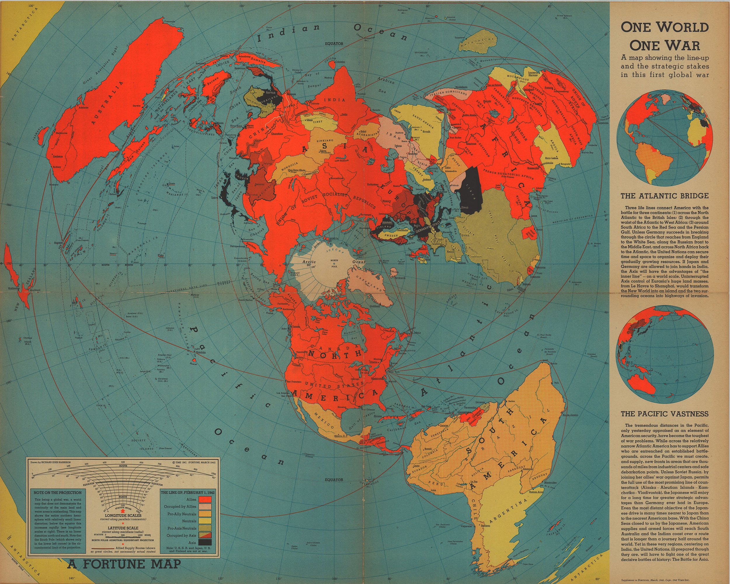
Richard Edes Harrison, The World Divided, Fortune (August 1941). Courtesy of P J Mode’s Persuasive Maps (1297.01). Click on image for higher resolution
In addition, the 1940 Republican presidential candidate Wendell Willkie wrote the stirring text for the prologue, conclusion, and section labels. A number of other people whose names are familiar to me also consulted, including John K. Wright of the American Geographical Society, especially known for his essay, “Mapmakers Are Human” (Wright 1942); Walter W. Ristow, of the Geography and Map Division of the Library of Congress (Ristow 1943); S. Whittemore Boggs, Geographer of the State Department, who would write the manual for US map catalogers (Boggs and Lewis 1945) and a popular essay about propaganda mapping (Boggs 1947); and the Rand McNally map maker Helmuth Bay, who in the same year as the exhibition gave an historically minded account of cartography as the Eighth R.R. Bowker Memorial Lecture to the New York Public Library (Bay 1943).

preliminary model of the exhibition layout (does not quite match up with the photographs of the final installation. It would of course be too much to ask that a model was included in the actual exhibition, as a map of itself …
The exhibition proper was in five parts, of which the first is of interest here. After section I, on “How Man Has Drawn His World,” the exhibition contained: II, “The Development of Flight,” from the pterodactyl to the present; III, “Theatres of War” in which the USA was then engaged; IV, “Global Strategy,” and the repudiation of Germany’s geopolitics by the newly formed United Nations; and V, “The Nature of the Air” that aviators must understand.
How Man Has Drawn His World (as Explained)
Section I was introduced by Willkie’s introductory panel:
How Man Has Drawn His World
From the beginning of history, man has made maps to match his expanding knowledge of his surroundings. Homer’s world, a little flat disk around the Mediterranean, grew slowly into a sphere.
Since the sixteenth century, Mercator’s projection has been accepted as a reasonably workable picture of the world. Mariners have used it for hundreds of years. But its conception is dangerously misleading in our air age. The course over the top of the world is now clearly the shortest and the speediest way to friend and enemy alike, a course impassable to ocean ships. But the frozen waters and icy wastes around the North Pole offer no major obstacles to the swift ships of the air. Man must re-draw his world. (Wheeler et al. 1943, 4)
In line with this pronouncement, the published account of the exhibition’s first section focused on the inadequacy of Mercator’s projection for the new air-age, in which respect it fed off a general sentiment stoked by Harrison’s world maps for Fortune and by various attempts in the early twentieth-century to create “compromise” projections that captured the look of the globe without Mercator’s egregious poleward distortions.
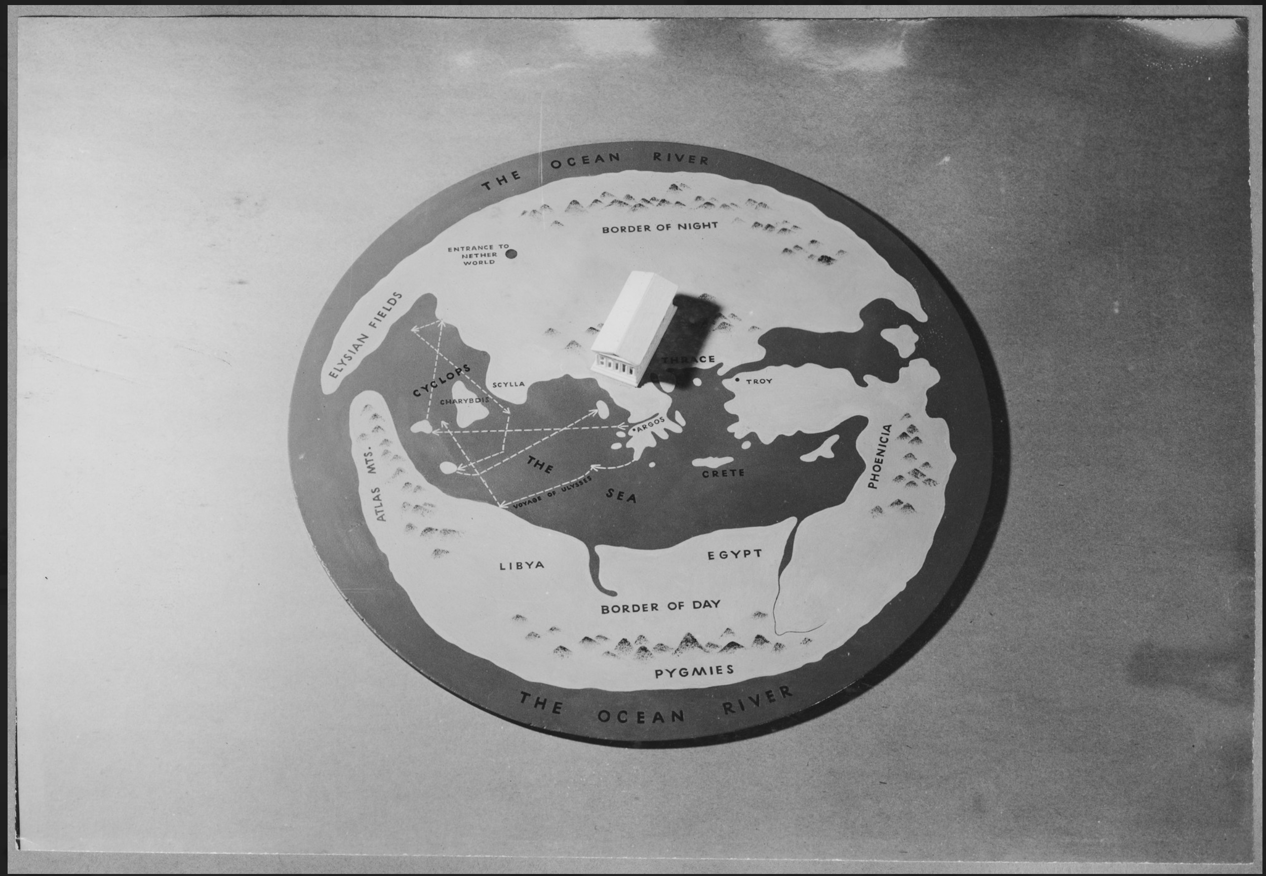
First, the idea that since earliest times man cartography was of great antiquity was established by a “reconstruction” of “Homer’s World, ca. 900 B.C.”:
with the accompanying text:
Homer’s World, ca. 900 B.C. No maps used by the early Greeks have survived, but from their writings we can reconstruct their conception of the earth they inhabited. Thus to Homer the world was a disk surrounded by the stream of ocean and roofed with the dome of heaven. (Wheeler et al. 1943, 4)
The practice of “re”constructing ancient maps has a long history and, as the label implies, is based on gleaning textual references to places, regions, rivers, and seas. By and large, these references are then situated in a map grounded in modern geographical knowledge. We have no idea about how Homer (had such a single person ever existed) understood the coastlines of Greece and Asia Minor, for example, but in this constructed image their outlines are plainly derived from detailed modern work. The map certainly has little in common with the map of the world that the Iliad describes as constituting the cover to Achilles’ shield.
The map’s maker has also added dashed lines westwards from Greece through the Mediterranean, which seem to be the route of Odysseus’ travels as he sought to return to Ithaca after the fall of Troy. It’s as if Odysseus had been an explorer, whose reportage made Homer modify his world map!
The thing that really gets me about this map, though, is the placement by Greece of a model of what looks like the Parthenon. That great temple was built and consecrated only in the fifth century BCE, four hundred or more years after Homer is presumed to have lived. Wikipedia tells me that monumental buildings began to appear in Hellenic culture only in about 600 BCE, and was distinct from earlier Minoan and Mycenaean architecture. But regardless of the anachronism of the model temple, the massively out-of-scale model serves the crucial function of tying the act of experiencing place (through hunting, travel, etc.) to the wider understanding of the earth/world. The model makes plain the apparent truth to Willkie’s opening statement, that “from the beginning of history, man has made maps to match his expanding knowledge of his surroundings,” and sets the stage for the progressive alteration of that knowledge: “Homer’s world, a little flat disk around the Mediterranean, grew slowly into a sphere.”
The published account then gives three pages of photographs of the installation, with facsimiles of early world maps and charts hung on walls decorated with abstract patterns of contour lines. The label to the first seems to refer to the antiquity of the azimuthal equidistant projection being pushed by Harrison (“the most useful projections for the conquest of the air”). The label also hopelessly confuses the modern aviator’s act of observing the landscape below and the act of looking at a world map and to comprehend the nature of the earth:
Partial view of the map section, which shows that the aviator did not have to have new types of maps. Even before Mercator published the projection which has served mariners so well, the most useful projections for the conquest of the air had been discovered. But they had been neglected for some time. Most adults have learned geography from Mercator maps, and it is hard to readjust the eye and the imagination to other maps better suited to the air age.
If we understand the purpose for which each map is made, and remember that no flat map can portray the world accurately, we cannot be misled. When in doubt, look at a globe, not a map. (Wheeler et al. 1943, 5)
The next view of the installation is a close-up of part of the previous view. Here, a very small reproduction of Mercator’s 1569 wall map is placed next to a pairing of a small globe and a modern world map on Mercator’s projection; Greenland is inked in heavily on the globe, and black strings lead the viewer from Greenland on the globe to the greatly enlarged Greenland on the map; and just so the viewer gets the point, a tracing of Greenland on the globe is superimposed on the map, dwarfed by the map’s depiction of the island. The label is similarly obvious:
HOW MUCH DOES MERCATOR DISTORT?
All flat maps are distorted, and the greater the extent of the surface of the earth included on them, the worse the distortion. Furthermore, their inaccuracy is not evenly distributed. Here is a Mercator map, the length of which along the Equator is the same as that of the adjacent globe. The Equator is its center of accuracy. As the eye travels away from that center, the inaccuracy increases. This display compares Greenland on the globe with Greenland on the map.
In the upper left hand corner may be seen a reproduction of the first publication of Mercator’s famous world map, 1569. Its modern version, shown below, is still found indispensable for surface navigation. (Wheeler et al. 1943, 6)
The previous photograph of the installation also reveals that just to the right of the globe-and-map was an sphere inside a clear, plastic cylinder, explaining why Mercator’s projection distorts in the way that it does. This seems to be the same model that Harrison previously reproduced in an essay for Infantry Journal (Harrison and Strausz-Hupé 1942, 39).
The sequence of installation photographs culminate in the modern triumph of air-age cartography. A large circular world map by Harrison, prominently entitled “Airways to Peace,” occupies the final wall in the section:
On the wall in the background may be seen an eleven-foot polar projection (azimuthal equidistant) upon which are shown the major air routes of the future. At the right is the suspended “outside-in” globe (page 9). (Wheeler et al. 1943, 7)
The last is a feature promoted in MoMA’s press releases as the highlight of the exhibition. A fifteen-foot diameter sphere suspended from the ceiling, the oceans of the southern hemisphere were cut away so that people might walk within the globe; the exterior, convex surface remained unfinished, but the interior, concave surface was painted with maps of the then political boundaries, demonstrating how the landmasses all cluster around the frozen north pole (Wheeler et al. 1943, 9). This was of course Harrison’s fundamental point in promoting the north-pole centered azimuthal equidistant projection, and the core reason for its adoption (slightly modified) for the logo of the United Nations (McLaughlin 1995; Schurdel 2005). (Most of the photographs of the installation curated by MoMA are of the outside-in globe and its construction: Wheeler et al. 2017 [1943]).
The last of the photographs of section I was of Monroe Wheeler comparing two globes. One was the “president’s globe” that the US Army had recently given to FDR as a Christmas present in 1942 (Robinson 1997). One of the MoMA press releases announced the installation of the globe—with its 17,000 placenames—for the first two weeks of the exhibition, implying that FDR did not want it absent from his study in the White House for too long (Wheeler et al. 2017 [1943], file 325403, 1). The other globe was a facsimile of Martin Behaim’s 1492 globe. The globes are placed beside each other, and Wheeler is posed as if he is comparing them:
MOST ANCIENT AND MOST MODERN GLOBES
Monroe Wheeler, director of the exhibition, compares the Behaim globe of 1492, oldest extant terrestrial globe, with President Roosevelt’s Fifty-Inch Globe, the largest and most modern in existence, which he has graciously lent to the exhibition. The globe ordinarily stands behind the President’s desk in the White House. The scale of the globe is one ten-millionth of the size of the earth, and it contains over 17,000 place names. It is mounted upon universal rubber bearings, permitting easy rotation, so that any part of the surface may be measured and examined freely. It was given to the President by the Army at Christmas, 1942.
Behaim had only one ocean on his globe—the Atlantic, bounded by Europe and Africa on the east and by China and India on the west. No North or South America was then known to exist.
Replica of Behaim globe lent by the American Geographical Society. (Wheeler et al. 1943, 8)
All told, the published account of the exhibition stayed true to the exhibition’s overall purpose. It returned to this grand theme in the concluding summary, that a modern age of global and airborne war needs a new conception of the world if peace is to be attained:
I. HOW MAN HAS DRAWN HIS WORLD.
The progress of map-making is surveyed in twenty-five exhibits, from the earliest known map, of Ga-Sur, Assyria, ca. 2400 B.C.; a model of Homer’s world; the world as conceived by Anaximander; Roman road maps; and the epochal maps of Ptolemy, Leardo and Mercator; the Behaim globe of 1492; the visionary polar projection of Glareanus (1510); and so on to the latest polar projections showing the air routes of the near future. Great circle routes are demonstrated, and a special gauge permits the visitor to measure great circle distances in miles and hours of flight between any two points on the globe.
In a war which knows no boundaries, it is necessary for the civilian to have a true concept of the globe. Flat maps convey it only distortedly by means of projections, which are misleading unless their specific purpose is understood. For general understanding we must turn to the three-dimensional globe, and for this reason the Museum constructed an “outside-in” globe, fifteen feet in diameter.
Upon entering this globe, the spectator finds the land areas depicted on the inside of the globe, enabling him to observe at a glance how three-quarters of the earth’s land is in the northern hemisphere, and the extraordinary proximity around the North Pole of the most populous and powerful nations, within easy flying distance of one another—a fact which is the crux of history today. In spite of its great size, the “outside-in” globe is of demountable construction and can easily travel with the exhibition to other cities.
The President’s Globe. A unique addition to the New York showing of Airways to Peace is President Roosevelt’s Fifty-Inch Globe, the largest printed globe in the world (page 8). It was the Army’s Christmas present last year to its Commander in Chief, and at the same time a replica was presented to Prime Minister Churchill.
Another feature of the map section is a five-foot layered relief model of Europe by Norman Bel Geddes, made to assist aviators in distinguishing the terrain and anticipating the height of vertical elevations.
A glass antipode globe permits the visitor to sight through a point at the center of the earth to find the antipode (opposite place) of any of the great cities of the world.
How Man Has Drawn His World (Listing of Exhibits)
A checklist prepared by the MoMA registrar has been included among the archival materials, on which this listing is based (Wheeler et al. 2017 [1943], file 325397). The checklist is not always clear, and many of the maps are those created by Harrison and his contemporaries, but those items that seem to pertain specifically to constructing a sense of map history are as follows. Notes added for clarification, together with commentary about the maps from an undated MoMA press release (Wheeler et al. 2017 [1943], file 325403):
Ga Sur. Oldest Known Map. ca. 2500 B.C. Lent by Semetic Museum, Harvard University (Reproduction)
Ga-Sur Clay Tablet, oldest known map in the world. ca. 2500 B.C. The original of this 2 1/2 inch clay tablet, excavated by Americans near Ancient Ga-Sur, in Iraq, is now in Baghdad. It shows a sea, two rivers, two mountains and three cities. The cuneiform inscription is badly broken; the only complete characters remaining have been translated “the site of the fortress of Ibla” which was perhaps in ancient Syria. The exact replica shown in the exhibition has been lent by the Semitic Museum of Harvard University.
• i.e., a cast of a clay tablet excavated at Yorgan Tepe, Iraq, showing a river valley and bounding hills (Millard 1987, 113–14); the lending institution is now known as the Harvard Museum of the Ancient Near East.
Marshall Islands Chart of Reeds. Reproduction Courtesy Museum of Natural History
• i.e., a “stick chart,” one the works famed for showing the ability of Pacific Islanders to navigate long distances; not likely of actual use (Finney 1998). Imaged in one of the archival photographs beside the following item.
Eskimo Coastal Charts. Facsimile. Courtesy Helmuth Bay.
• installed beside the “stick chart” and depicted in the same installation photograph, these were originally a pair of pieces of wood carved by Inuit to capture the bays and headlands of coasts in the Canadian Arctic. Such carvings were also famed for their precision and evidence accuracy.
Anaximander’s Map. 6th Century B.C. (from writings)
Homer’s World (under glass dome) ca. 900 B.C.
Homer’s World. ca. 900 B.C. No maps used by the early Greeks have survived. This model, built especially for the exhibition, reconstructs the ancient Greeks’ conception of the world they lived in: a flat disc roofed with the dome of Heaven and completely encircled by Oceanus. To the north of Thrace toward the country of the barbarians lies the Border of Night with the entrance to the Nether World in the direction of modern Europe. The Elysian Fields are to be found on a promontory far to the west, undoubtedly the Iberian Peninsula of modern geography. Phoenicia lies to the east, and the Border of Day is southward beyond Libya and Egypt toward the country of the pigmies. Scylla and Charybdis, between which ran the dangerous narrows navigated with fear by the ancient mariners, are now identified as a rock in the toe of the Italian boot and a whirlpool on the Coast of Sicily between which run- the Straits of Messina, even more dangerous to modern mariners because of allied bombings.
• see image and discussion above
Ptolemy’s Map ca. 150 A.D. Reproduction Courtesy Dr. A. S. W. Rosenbach and Fortune Magazine, Time, Inc. (Framed and glass) [gifted to MoMA]
Ptolemy’s Map. ca. 150 A.D. Claudius Ptolemy of Alexandria was one of the great cartographers of all time. He summarized the cartographical and geographical knowledge of his Greek predecessors, and produced an atlas of twenty-eight maps. His world map was constructed on scientific principles, with latitude and longitude grids. Neglected for more than twelve hundred years, Ptolemy’s atlas was re-discovered and translated into Latin early in the fifteenth century, influencing pre-Columbian cartography profoundly. The projection used in the exhibition resembles the conic type of map and extends over 180° of longitude. Reproduction courtesy of Dr. A. S. W. Rosenbach and Fortune Magazine, Time, Inc.
• i.e., the facsimile of the world map from the 1482 Ulm edition of Ptolemy’s Geography was the one map among seven reproductions of works from A. S. W. Rosenbach’s library/stock, published in Fortune 5, no. 4 (1 April 1932): 60–69, 114, 116, 119
St. Sever Beatus Map. ca. 1050 A.D. Reproduction Courtesy American Geographical Society (framed and glass)
St. Sever Beatus Map. ca. 1050 A.D. Mediaeval monks made this world map, with the Garden of Eden at the top. The idea of a spherical earth was considered heretical. Maps were generally rectangular, oval or round. Reproduction courtesy of the American Geographical Society.
• i.e., the world map, probably in Konrad Miller’s 1929 facsimile, from the commentary on the Apocalypse by the Beatus of Liebana produced in Saint-Sever abbey, France
Leardo’s Map of the World 1452–3. Reproduction Courtesy American Geographical Society. [gifted to MoMA]
Giovanni Leardo’s Maps of the World. 1452–53. A mediaeval map revealing the typical conception of the earth in the years preceding the discovery of America. The scientific (but heretical) knowledge of the classical past was beginning to be re-discovered and used. Reproduction courtesy of the American Geographical Society.
• the Leardo map is one of the great treasures of the AGS Library; at the time of the 1943 exhibition, the AGS was still in Manhattan, just off Times Square.
Photo. Portolan Chart 1468 by Petrus Roselli. Photo. Courtesy Hispanic Society of America [gifted to MoMA]
• i.e., Hispanic Society K35, previously reproduced in monochrome in Edward Luther Stevenson, Facsimiles of PortoIan Charts Belonging to the Hispanic Society of America, Publications of the Hispanic Society of America, no. 104 (New York: Hispanic Society of America, 1916), plate 2. This exhibit might have been a specially prepared photograph.
Columbus’ World 1492. Map Courtesy Weber Costello Co.
• Weber Costello was the company that made the President’s globe (above), but the registrar refers to this as a map, not a globe. A quick search of the usual places has not generated a possible work.
Turkish Map of the Atlantic Ocean and its Coasts. 1513. Lent by the American Geographical Society (Facsimile of Piri Reis Map)
• i.e., the surviving fragment of a world map by the Ottoman admiral, Piri Reis.
Original Mercator Projection. Reproduction
• a much reduced copy of the 18-sheet map in the Bibliothèque national de France.
• at the same time, the press release listed a copy of Edward Wright’s 1599 world map, which I can’t associate with the checklist. I’m probably missing something obvious.
Wright World Map. 1599. Gerhard Mercator, a Flemish geographer, produced in 1569 the world chart on the cylindrical projection which still bears his name. Designed for use in navigation, the projection did not become popular until Wright, an Englishman, used it for a world map thirty years later. This is believed to be the map mentioned in Shakespeare’s Twelfth Night, when Maria says of Malvolio: “he does smile his face into more lines than are in the new map with the augmentation of the Indies.” Courtesy of the American Geographical Society.
Behaim Terrestrial Globe, Lent by American Geographical Society.
Behaim Globe, 1492. The oldest extant terrestrial globe, constructed by Martin Behaim of Nuremberg. An exact replica is shown in the exhibition. This globe indicates that certain mediaeval scholars accepted the ancient Greek idea of a spherical world. Although this globe shows the explorations of the Portuguese around Africa, Behaim still relied heavily on the cartographic ideas of Ptolemy, And there was only one ocean on his globe—the Atlantic, bounded by Europe and Africa on the East and by China and India on the West. No North or South America was then known to exist.
• i.e., the facsimile prepared by E. G. Ravenstein in 1908, glued to a ball and mounted on a stand emulating that of the original.
Map of the Roman Road. Reproduction Courtesy of the American Geographical Society
Roman Road Map. Drawn in sections, totaling twenty-one feet, this map does not give true directions and distances, but towns, castles, and other landmarks are portrayed in colorful and pictorial detail. Showing that all roads lead to Rome, represented on the map is a crowned and sceptered woman seated on a throne and holding the world in one hand. Reproduction courtesy of the American Geographical Society.
• i.e., one of the many facsimiles of the Peutinger map, probably of the section including Rome. The map that survives today (in the Österreichische Nationalbibliothek) is a twelfth-century copy of a work dating from the fourth century (Talbert 2010). AGSL possesses at least three facsimiles, from 1624, 1652, and 1888 (by Konrad Miller). Perhaps the last one, in color, was used in 1943.
Cassini Polar Projection, 1682 (edition 1696) Courtesy Wm. L. Clements Library of American History. The University of Michigan (Reproduction) (Framed and glass)
• i.e., the reduction by Jacques Cassini II of the map drawn by his father on a floor of a tower room in the Paris Observatory, found in 1927 in the Clements Library (see also Brown 1941). As one of the earliest modern uses of an azimuthal projection, this map was important to Harrison’s rhetoric!
Mercator Polar Projection, 16th Century. Reproduction. Courtesy American Geographical Soceity [sic] (Framed and glass)
• this was probably one of the versions of Mercator’s map of the north polar cap, such as this one. Gerardus Mercator originally made a map like this as an inset on his large 1569 world map, and then it was issued as a separate map by his several heirs. Again, as a polar azimuthal projection, this map sustained Harrison’s appeal to history to justify his own work.
Conclusions
All told, the narrative presented in the MoMA exhibition was very much in line with the established historiographical structures that had been created for the history of cartography. Globalist map historians in the nineteenth century had blended several elements into a grand metanarrative. (1) The origins of cartography lay with the wayfinding practices of early peoples, practices that were replicated by indigenous peoples in the modern era (Pacific islander “stick charts”; Inuit wood carving). (2) The Greeks and Romans developed the idea of the world map from travels and explorations, a system that culminated in Ptolemy. (3) Medieval geographers reneged on the achievements of Classical philosophy and returned to a Biblically determined flat earth, only challenged by the renaissance rediscovery of Ptolemy etc. (To be clear, this is NOT a good summary of history!). (4) Mercator’s apparent merging in his world map projection of marine charting and geographical mapping was the culmination of this developmental process; while quite wrong-headed, the supposed dominance of Mercator’s projection certainly fed into the larger desire to change the global imaginary for the air age.
At the same time, “Airways to Peace” added an element from the still relatively recent argument that cartography had always been a science and technology. The emphasis on the Mesopotamian clay tablet placed the origin of cartography in the observation and measurement of discreet places, a point reinforced by the temple placed atop the Homeric world. The history of cartography is thus the history of an ever-improving science and technology. Critics in the last few decades have tended to make much of this particular narrative structure, along with the closely related structure that cartography has progressed from an art to a science, as a characteristic of map history from its origins in the early nineteenth century. But both narrative structures are actually creations of the 1920s and 1930s, when studies of early maps sustained the modernist expectations of past and ongoing progress in human civilization.
To this point, the historical narrative is not that different from the brief summary offered by Helmuth Bay (1943). Bay began with a “fanciful” yet “factual” imagining of the occasion of the first map being made by a stone-age hunter to inform the rest of his band as to the location of prey. This imaginative yet “logical” account of the “birth of the map” gave way to Inuit carved wood and Pacific networks of sticks and shells [citing the same item as displayed at MoMA], to detailed Mesopotamian plans, to the Greeks, and so on. Bay actually sidetracks into a more settler-colonial narrative, in which the initial imperialistic mapping gives way to the more detailed maps of the US colonies as they transform into state. Finally, after some generalities about how one makes geographical maps, Bay concluded by talking about the perfection of territorial mapping prompted by the world wars and by the recent introduction of aerial photogrammetry.
But the larger narrative of the MoMA exhibit went further than Bay’s and other commentaries at the time. The appearance of a few circular maps not commonly adduced in regular histories of cartography connected the progressive history of maps to the present and to Harrison’s mission to replace rectangular world maps with circular ones. The exhibition also included a few examples of Buckminster Fuller’s recently invented dymaxion world map, but these were very much overshadowed by all the Harrison, north-polar azimuthal equidistant projections in the show.
“Airways to Peace” was a show to push public understanding of maps and mapping into the future. To discard old ways of doing things and to adopt new ways as the USA took center stage in global politics. A new global imaginary was needed to displace the Mercator maps that showed off the old, exhausted maritime empires of Europe, and that new global imaginary was one of polar interconnection and centeredness.
References
Bay, Helmuth. 1943. The History and Technique of Map Making. New York: New York Public Library. Reprinted in The Bowker Lectures on Book Publishing, Second Series (New York: The Typophiles, 1945), 101–34.
Boggs, Samuel W. 1947. “Cartohypnosis.” Scientific Monthly 64, no. 6: 469–76.
Boggs, Samuel W., and Dorothy Cornwall Lewis. 1945. The Classification and Cataloging of Maps and Atlases. New York: Special Libraries Association.
Brown, Lloyd A. 1941. Jean Dominique Cassini and his World Map of 1696. Ann Arbor: University of Michigan Press.
Finney, Ben. 1998. “Nautical Cartography and Traditional Navigation in Oceania.” In Cartography in the Traditional African, American, Arctic, Australian, and Pacific Societies, ed. David Woodward, and G. Malcolm Lewis, 443–92. Vol. 2.3 of The History of Cartography. Chicago: University of Chicago Press.
Harrison, Richard Edes, and Robert Strausz-Hupé. 1942. “Maps, Strategy, and World Politics.” Infantry Journal 51, no. (November 1942): 38–43.
McLaughlin, Donal. 1995. “Design for Peace.” United Nations Chronicle 32, no. 3: 20–21.
Millard, A. R. 1987. “Cartography in the Ancient Near East.” In Cartography in Prehistoric, Ancient, and Medieval Europe and the Mediterranean, ed. J. B. Harley, and David Woodward, 107–16. Vol. 1 of The History of Cartography. Chicago: University of Chicago Press.
Ristow, Walter W. 1943. “Maps: How to Make Them and Read Them. A Bibliography of General and Specialized Works on Cartography.” Journal of Geography 42, no. 7: 258–65.
Robinson, Arthur H. 1997. “The President’s Globe.” Imago Mundi 49: 143–52.
Schurdel, Harry D. 2005. “Im Zeichen des Friedens: Zur Entstehungsgeschichte des UN-Emblems.” Vereinte Nationen: German Review on the United Nations 53, no. 5: 207–10.
Talbert, Richard J. A. 2010. Rome’s World: The Peutinger Map Reconsidered. Cambridge: Cambridge University Press.
Wheeler, Monroe, Herbert Bayer, Rand Warren, and Richard Edes Harrison. 1943. “Airways to Peace: An Exhibition of Geography for the Future.” Bulletin of the Museum of Modern Art 11, no. 1: 1–24.
————. 2017 [1943]. “Airways to Peace, 2 July–31 October 1943.” Museum of Modern Art. https://www.moma.org/calendar/exhibitions/3138.
Wright, J. K. 1942. “Map Makers Are Human: Comments on the Subjective in Maps.” Geographical Review 32: 527–44.