A “Radically Different” World Map?
/Not actually so different, after all. A mindboggling, gobsmacking claim!
Consider my mind boggled, and my gob smacked. I have just learned, through the miracles of Twitter, of a press release from Princeton University, that has me hyperventilating at the sheer audacity of the PR work and the chutzpah of the claims being made. I am sure that much of the breathlessness of the piece and the claims to intellectual and mathematical glory—by astrophysicists no less!—stem from being filtered through the PR machine, but I nonetheless feel thoroughly physplained!
[update 20 February 2021] My brain was so amazed by the post, that I failed to recognize a link to the actual paper by the astrophysicists; see end of the post for more info.
[update 21 February 2021] I have written a commentary on the paper in which the astrophysicists explain the metric that underpins their claims to radical difference etc. (tl;dr the metric is not valid)
The piece is, “Princeton astrophysicists re-imagine world map, designing a less distorted, ‘radically different’ way to see the world” and it was published by Princeton’s Office of Communications on 15 February 2021. Let me start not as the article does, with the remarkably lame video of a two-sided world map being flipped, but with the image of “Gott, Goldberg and Vanderbei’s revolutionary, double-sided disk map” that “minimizes all six types of map distortions”:
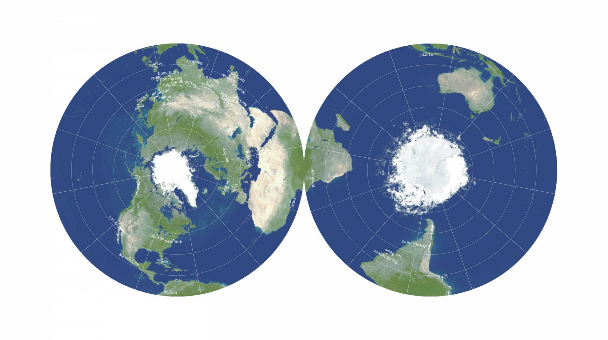
Rather than using some nifty statistical technique to balance out distortions in shape and area, as has been done since the nineteenth century, which is what the PR lingo implies, the creators have actually used the azimuthal equidistant projection in polar aspect to show the northern and southern hemispheres separately. When applied to the whole earth, this is the same projection as used on the UN flag and also, as it happens, by Flat Earthers. In a polar aspect, the pole is surrounded by equally spaced, concentric circles of parallels of latitude, so that “scale is correct” along the meridians; it is thus “equidistant” along the meridians. (In “equidistant” projections, distances are consistently scaled only along certain lines; a more general equidistant map is called a globe.)
Now, tell me, how is this map different from Gerard de Jode’s 1593 world map in two hemispheres, polar aspect, on the azimuthal equidistant projection? (While this map has few parallels of latitude to reveal their consistent spacing, it does show the circles, and the distances from pole to Arctic/Antarctic circles is the same as the distances from the tropics to the equator, so it is equidistant.)

This map is Shirley 184. Sorry to say, I’m not sure of the source (I’ve had the file since 2011).
[update 20 Feb 2021] Luis Robles has shared on Twitter an even earlier double hemisphere, polar aspect, azimuthal equidistant projection, by Henricus Glareanus in 1513, now in the John Carter Brown Library (click on image to see all of the maps in Glareanus’s manuscript - they’re v cool!):

The PR release also states, that the new map “can be displayed with the Eastern and Western Hemispheres on the two sides,” in which case you’re looking at the basic orientation of over 75% of all world maps printed in Europe between 1600 and 1800 (although almost all of these used the [conformal] azimuthal stereographic projection) and about 50% (my estimate) of world maps in the nineteenth century (mostly on Arrowsmith’s “globular” minimum-error projection). Here’s one from 1936, care of www.davidrumsey.com:

The PR blurb states:
To the best of [the astrophysicists’] knowledge, no one has ever made double-sided maps for accuracy like this before. A 1993 compendium of nearly 200 map projections dating back 2,000 years did not include any, nor did they find any similar patents.
This “1993 compendium” links to the sales page at the University of Chicago Press for John Snyder’s text, Flattening the Earth. A great book, to be sure, but not one that covers every single map projection and how each was used.
[update 9 August 2022]
In reading Wellman Chamberlain’s The Round Earth on Flat Paper: Map Projections Used by Cartographers (Washington, D.C.: National Geographic Society, 1947), I just found the following passage. Originally thinking that it described the idea of hemispheres pasted back-to-back, I realized that it presents a better way of doing things!
In answer to requests for the best world map for showing airlines, Natinal Geigraphic Society cartographers suggest that the hemispheres of this map [azimuthal equidistant] can be cut out, mounted on heavy board, and pivoted on the poles so that any meridian can be made continuous,…. With this arrangement it is possible to turn the hemispheres so that any airline which crosses the equator can be shown in unbroken line, and many useful distances can be measured upon it. (p. 94)
A cross-reference points to p. 71, and a photograph of this arrangement.

By rotating the two hemispheres about the poles, one can see the uninterrupted airline route across the erstwhile interruption of the equator. Measuring the length of that airline route is not, however, all that feasible, as the azimuthal equidistant is only true-to-scale along great circles radiating out from the center of projection (meridians on the polar aspect, as here). Only of the route is north/south, as shown in the NGS image, is the measurement at all close to true!
The creators compare their new map to world maps on Mercator’s Projection (conformal, so shapes are correct, but of course at the expense of tremendous areal distortions) and also the Winkel Tripel, which is a minimum-error projection and is (I think) currently used by National Geographical Society for their world maps. By comparison, they argue that their map, especially when the two hemispheres are pasted together back-to-back, means that “distances across oceans or across poles are both accurate and easy to measure, unlike one-sided flat maps.” In fact, there is the comment that one can take a string and wrap it around the edge to measure distances from one hemisphere to the next.
And the PR flack concludes with a quote from one of the creators:
“Our map is actually more like the globe than other flat maps,” Gott said. “To see all of the globe, you have to rotate it; to see all of our new map, you simply have to flip it over.”
As I say, I am utterly and thoroughly gobsmacked.
Underpinning all this sheer stupidity and naivety are some serious points about what these astrophysicists understand maps to be. It is not that they are ignorant of the mathematical principles; two have published a paper in a map journal on their measures of map distortion (Goldberg and Gott 2007; also Gott, Mugnolo, and Colley 2007). But it seems that from their highly mathematized perch they have realized that world maps are actually useful for imaging and visualizing the world. But they want the maps to also be as accurate as possible, according to their own idiosyncratic criteria. Antarctica should be shown round, as it is; Buckminster Fuller’s faceted dymaxion map meets that criterion, but at the cost of “shattering” the oceans.
Interestingly, the astrophysicists are open to interrupting the world map. Interrupted world maps, such as Goode’s homolosine, have been unpopular in the twentieth century precisely because they don’t show the earth’s surface in a continuous manner. Interrupted maps contravene the modern desire to see the entire world as one, as an act of surveillance. But they have not been unknown, especially as a means to prevent distortions from accumulating. This was one of the reasons that the double-hemisphere world map was so popular, with each part of the map projected separately. (Modern topographical map series similarly depend on the repeated projection of portions of the earth’s surface, only they do it in such a way as to hide the interruptions.) But it seems that they are willing to accept the single interruption that divides the earth into two hemispheres only if the two halves are then glued together.
Ultimately, once one has stripped away the immense amount of PR guff and hyperbole, there’s little to recommend this as a “new” and “different” – other than the proposal to paste the two halves together. And I’m pretty sure I’ve seen an eighteenth- or nineteenth-century hand-held fan with hemispheres drawn on either side …
They have really only reinvented the wheel.
[update 20 February 2021]
The three astrophysicists have submitted a paper to Instrumentation and Methods in Astrophysics and is available at ArXiv. I am not au fait with pre-pub services in the natural sciences, so I think it was only submitted on 15 February and I don’t think that it has passed peer review yet. Now that I am dealing with the actual work and not a puff piece by a publicist, I am comfortable with giving the astrophysicists’ names: J. Richard Gott III, David M. Goldberg, and Robert J. Vanderbei. The paper is entitled, “Flat Maps that improve on the Winkel Tripel.”
The authors have previously developed a set of mathematics for defining 6 kinds of error in map projections, by which to produce a summary score or “fidelity metric” (Goldberg and Gott 2007), that they applied in a quest to determine the map projection with the smallest error scale. They had found that the Winkel Tripel had the lowest score, and since modified certain attributes to create the Gott-Wagner projection with a fractionally lower score (Gott and Vanderbei 2010). To be honest, their proliferation of error factors in addition to the usual two (in shape and area) smacks of the kind of extraneous qualities that Arno Peters invented to puff up his own projection.
The rhetorical crux of the paper is the assertion that in getting further improvement in error score without resorting to making terrible maps will only produce small increments. What is needed is a radical new approach. They look to a recent solution to the impossibility under Euclidean rules of trisecting an angle, which uses Euclid’s straight edge and compass plus allows folding of the paper. They therefore investigate the radical approach of folding the map. Polyhedral maps, like Buckminster Fuller’s famous dymaxion map, already employ folds (or is this simply folding separately projected facets along mutual edges to approximate a globe?) but such maps have poor error scores.
To cut a long story short, the double-sided map is a physical manifestation of a mathematical conception, in which the value of a map is defined solely by its fidelity metric. They note that the key innovation is the separate projection of each hemisphere which minimizes the four factors of isotopy (shape correctness = conformality), area, flexion (“the apparent bending of great circle routes on the map”), and skewness (“lopsidedness”). The error in “boundary cuts” they take to be zero because, mathematically speaking, there is no interruption in the map, only a fold. Distance measures from one hemisphere to another are therefore also very low as the line of measurement is continuous. All one has to do is forget the physical implementation of the map requires not a fold but an interruption.
“Boundary Cut” is an interesting concept, and I think that I need to ponder it more and maybe write a separate blog post. For now, it stands as a factor whose conceptual significance is undefined but that adds significant weight to the statistics. A regular double-hemisphere map has a boundary cut of 360° (for a “boundary penalty, B” of 0.5); a cylindrical or pseudo-cylindrical world map projection like the Winkel Tripel that shows the poles but ends at a meridian on either side has a boundary cut of 180° (B = 0.25). Although the authors have multiple illustrations of the new projection as two hemispheres placed side by side (B = 0.5), the concept of pasting them back to back means that B = 0. This is all just word play and sleight of hand.
But is it not obvious that, when properly created as two hemispheres pasted back-to-back, the new projection does not show the whole world—which is to say that the fold is, in fact, an interruption? Yes it is, but the authors dismiss the problem with a rhetorical trick: one can’t see the entire globe either, so what’s the problem? Here’s the bit:
A disadvantage of our map is that you can’t see all of the map at once. This is often cited as an advantage of flat maps, in addition to their zero volume. Should an error for this be applied to our map? Should it be part of the error budget for maps? In the Goldberg and Gott (2008) paper the six errors considered are errors made in depicting, on a flat map, the spherical surface of the globe: the smaller the sum of squares of errors, the higher the verisimilitude (fidelity) to the actual spherical Earth. Of course, the globe itself, by this token, must have zero errors. It is a perfect map of itself. And the globe can’t be seen all at once, only half at most. So, in that sense, our double-sided flat map is actually more like the globe of the Earth than the other flat maps. Thus, it would not seem proper to introduce such an error term. Also, as we have commented before, our map has the same topology as the globe and wastes no paper surface. (pp. 21–22, original emphasis)
The point of world maps is to show the whole earth, but one can’t see the entire earth, so the most accurate world map doesn’t show the whole earth. This intellectual whiplash is a distorted extrapolation of the pictorial preconception of the ideal of cartography (Edney 2019). The rhetorical nature of the exercise is reinforced by the appearance of two further criteria for assessing maps: of topology (not in the 6 error factors and woefully undetermined) and of paper wastage (wait, what, really?). This paper is not as logically structured as the authors might think.
And then there’s the intellectually insulting part:
Finally, it is not even quite true that you can’t see all of our map at once. That is because you have two eyes! Tip the disk vertically with its equatorial edge aligned with your nose. Your left eye can see the entire Northern Hemisphere and your right eye can see the entire Southern hemisphere. It appears as splayed outward like butterfly wings, because of the parallax angle between your stereo eye views. You can use this trick when inspecting the continuity of South America and Africa as they drape across the equator. (p. 22)
The authors want their maps to be properly scientific and mathematically correct reproductions of the world, very much in accordance with the ideal of cartography (Edney 2019), and they dismiss similar maps in this format because they were only “drawings” and not real maps (p 21). They seem to recognize that the value of world maps is the visual display of the earth’s surface, but they cannot comprehend that visual display is the reason for world maps and that world maps are not instrumental devices. (They are confused by air-age polar maps that display and make understandable the transpolar routes of airplanes and ICBMs in the northern hemisphere, as if those maps were actually used to plot routes — no, other maps were used that were not even of hemispheric extent, let alone global.) The purpose of the world map is not to be as mathematically correct as a sheet from a territorial survey like the OS or USGS.
The language of the actual paper is not quite as egregious as the press release, but the same overblown claims are nonetheless there. The paper is a triumph of mathematical imagination over the realities of mapping as a cultural and social phenomenon. It fails because the authors do not understand that that imagination is itself a product of the cultural idealization of cartography.
The argument is like Zeno’s paradoxes: a walker cannot reach the destination, because they must first cross half the distance to it, and then the next half, and the next half. Of course, there comes a point when the remaining distance is less than the length of a step and, lo!, the walker reaches and crosses the finish line. Zeno’s mathematical imagination triumphed, in the pure world of math. But reality is not, of course, pure and the authors fail in attending to the one without thinking about the other.
References
Edney, Matthew H. 2019. Cartography: The Ideal and Its History. Chicago: University of Chicago Press. [added 20 February 2021]
Goldberg, David M., and J. Richard Gott III. 2007. “Flexion and Skewness in Map Projections of the Earth.” Cartographica 42, no. 4: 297–318.
Gott, J. Richard, III, Charles Mugnolo, and Wesley N. Colley. 2007. “Map Projections Minimizing Distance Errors.” Cartographica 42, no. 3: 219–34.
Gott, J. Richard III, and Robert J. Vanderbei. 2010. Sizing up the Universe: A New View of the Cosmos. Washington, D.C.: National Geographic. [added 20 February 2021]
Shirley, Rodney W. 2001. The Mapping of the World: Early Printed World Maps, 1472–1700. 2nd ed. Riverside, Conn.: Early World Press.
Snyder, John P. 1993. Flattening the Earth: Two Thousand Years of Map Projections. Chicago: University of Chicago Press.